How to Wear Bold Prints? Expert Advice for Mastering Pattern Mixing
Bold prints have become a defining element of contemporary fashion, transforming wardrobes from mundane to memorable. Whether you’re drawn to vibrant florals, geometric patterns, or animal prints, mastering the art of wearing bold patterns requires confidence, strategy, and an understanding of fundamental styling principles. Fashion industry leaders and trend forecasters consistently emphasize that bold prints are no longer reserved for the fashion-forward elite—they’re accessible to anyone willing to embrace their personal style narrative.
The key to successfully incorporating bold prints into your everyday look lies in understanding color theory, proportion, and the delicate balance between statement-making and wearability. In this comprehensive guide, we’ll explore expert strategies that transform bold prints from intimidating to incredibly chic, drawing insights from Vogue’s trend forecasting and industry professionals who’ve mastered pattern mixing. Whether you’re a seasoned style enthusiast or someone hesitant about experimenting with patterns, these actionable techniques will elevate your fashion confidence.
Understanding Print Psychology and Color Theory
Before diving into styling strategies, it’s essential to understand why certain prints resonate with us and how colors within those prints influence our overall appearance. Bold prints communicate confidence, creativity, and individuality—qualities that modern fashion celebrates. The psychology of color plays a crucial role in how bold prints affect your presence and the messages you convey to the world.
Color theory in fashion operates on several fundamental principles. Complementary colors—those opposite each other on the color wheel—create dynamic, eye-catching combinations. Analogous colors, positioned next to each other, produce harmonious, sophisticated effects. When selecting bold prints, consider the dominant colors and how they interact with your skin tone. Warm undertones are complemented by prints featuring golden yellows, warm reds, and terracotta shades, while cool undertones shine with jewel tones, blues, and purples.
The saturation level of a print matters tremendously. Highly saturated prints demand more styling restraint, while softer, muted versions offer greater versatility. Fashion professionals recommend exploring StyleLoom Daily Blog for detailed color analysis. Understanding your personal color palette ensures that bold prints enhance rather than overwhelm your natural features.
The Art of Balancing Bold Prints with Neutral Pieces
The golden rule of wearing bold prints successfully involves strategic neutralization. This doesn’t mean avoiding color entirely—rather, it means creating visual breathing room by pairing statement prints with solid, understated pieces. Neutrals serve as anchors, allowing bold prints to shine without competing for attention.
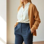
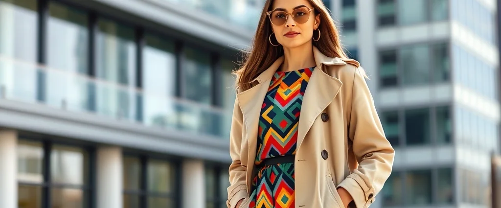
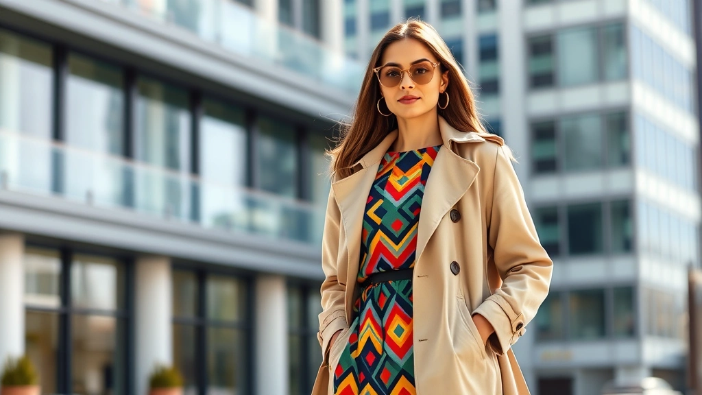
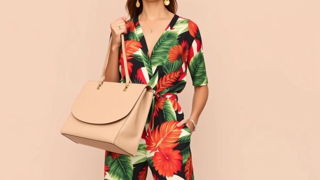
Classic neutrals include black, white, navy, gray, beige, and cream. However, contemporary styling has expanded the definition to include soft taupe, warm camel, and even muted olive. When wearing a bold printed top, consider pairing it with neutral bottoms like tailored trousers or a classic denim jacket. Conversely, a bold printed skirt or pants demands a solid-colored top in a complementary neutral shade.
The 60-30-10 rule, borrowed from interior design, applies beautifully to fashion. Allocate 60% of your outfit to a neutral base, 30% to your bold print, and 10% to accent pieces. This proportion ensures your bold print remains the focal point without creating visual chaos. Layer neutral cardigans over printed dresses, style printed trousers with crisp white shirts, or pair a bold printed blazer with solid-colored pants and simple accessories.
Strategic layering amplifies this balancing act. A neutral-toned coat or jacket instantly tones down an otherwise bold ensemble, making it appropriate for professional settings while maintaining your style statement. Harper’s Bazaar’s styling experts consistently recommend this approach for creating sophisticated, wearable looks that showcase personality without overwhelming the senses.
Pattern Mixing Techniques That Actually Work
Pattern mixing—the art of combining multiple prints in a single outfit—represents the pinnacle of styling sophistication. While it seems counterintuitive, mixing patterns creates visual interest and demonstrates advanced fashion knowledge. The key lies in understanding scale, color relationships, and visual balance.
Scale contrast proves essential when mixing patterns. Pair a large-scale floral print with a small-scale geometric pattern, or combine bold stripes with delicate dots. This contrast prevents visual competition and creates a cohesive, intentional appearance. Fashion designers and style consultants emphasize that when patterns share a common color, they automatically harmonize, regardless of their individual designs.
The color bridge technique simplifies pattern mixing significantly. Identify a shared color between your prints and build your outfit around this connector. For instance, if your bold printed top features coral and navy, select bottoms in either coral or navy, creating visual continuity. This approach transforms pattern mixing from chaotic to carefully curated.
Proportion and placement matter equally. When mixing prints, ensure they’re separated by solid colors or different garment categories. Wear a bold patterned top with patterned bottoms, but separate them with a neutral belt or layer. Alternatively, incorporate patterned accessories—scarves, bags, or shoes—to introduce secondary patterns without overwhelming the outfit. Understanding fashion design degree principles helps explain why professional stylists excel at pattern mixing.
Consider the occasion and setting when mixing patterns. Professional environments demand subtle pattern combinations using similar color families and smaller scales. Creative industries and casual settings welcome bolder, more adventurous pattern pairings. Confidence in your styling choices ultimately determines success—hesitant pattern mixing reads as accidental rather than intentional.
Styling Bold Prints for Different Occasions
Bold prints require contextual styling to ensure appropriateness across various settings. Office environments, casual outings, evening events, and weekend adventures each demand different approaches to incorporating statement prints while maintaining professional or occasion-appropriate aesthetics.
Professional Settings: In corporate environments, opt for muted or smaller-scale prints in professional silhouettes. A bold printed blouse paired with tailored neutral trousers and a structured blazer demonstrates fashion-forward thinking while respecting workplace norms. Alternatively, incorporate prints through accessories—a patterned scarf, belt, or structured handbag adds visual interest without appearing too casual. Fashion designers often recommend this subtle approach for corporate professionals.
Casual and Social Occasions: These settings invite bolder print expressions. Wear a vibrant printed dress with minimal accessories, letting the pattern speak for itself. Pair printed jumpsuits with statement jewelry and confidence. Mix bold prints with complementary pieces, creating outfits that showcase personality and style awareness. Weekend brunches, shopping trips, and social gatherings are perfect opportunities for experimental styling.
Evening and Formal Events: Sophisticated pattern application works beautifully for formal occasions. A bold printed gown in jewel tones or elegant geometric patterns creates dramatic impact. Alternatively, a printed blazer over a simple black dress elevates evening wear with unexpected visual interest. Ensure prints in formal settings maintain elegance through color sophistication and refined scale.
Seasonal Considerations: Spring and summer naturally align with bold, colorful prints—florals, tropical patterns, and vibrant geometrics feel seasonally appropriate. Fall and winter welcome darker, richer prints like burgundy florals, jewel-tone geometrics, and deep animal prints. This seasonal alignment ensures your bold print choices feel cohesive with the fashion calendar.
Accessorizing Your Bold Print Outfits
Accessories serve as the finishing touch that either grounds or enhances bold print ensembles. Thoughtful accessorizing prevents bold prints from appearing costume-like while amplifying their impact through strategic styling choices.
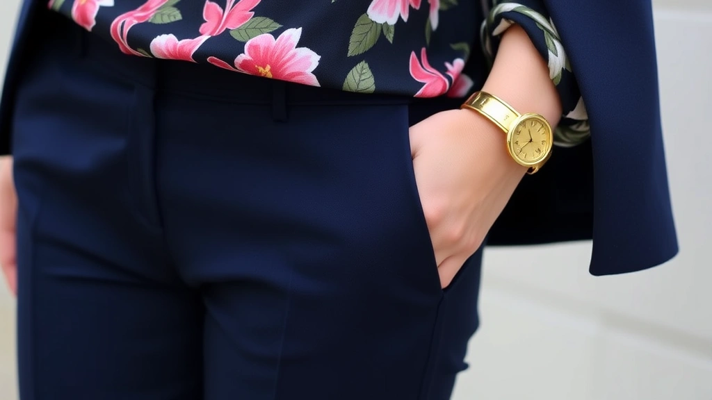
Jewelry Strategies: When wearing bold prints, jewelry should complement rather than compete. Choose pieces that either echo colors within the print or maintain neutral sophistication. Gold jewelry pairs beautifully with warm-toned prints, while silver complements cool-toned patterns. Consider the scale of your print when selecting jewelry—delicate pieces work with smaller prints, while bold prints can support statement jewelry without appearing overwhelming.
Footwear Selection: Shoes either anchor or elevate bold print outfits. Neutral shoes—black, white, nude, or metallics—create grounding visual weight. Alternatively, shoes in colors that echo your print create cohesive, intentional styling. Avoid shoes that compete with your print’s color intensity; instead, choose pieces that support the overall aesthetic.
Bag and Outerwear Choices: A neutral structured handbag instantly tones down bold prints, making them work-appropriate. Conversely, a printed or textured bag creates visual interest without competing with your outfit’s main statement. Outerwear like blazers, denim jackets, and coats provides essential visual anchoring. A neutral coat transforms a bold print dress into professional attire, while a patterned jacket elevates solid-colored basics.
Scarves and Wraps: These versatile accessories either introduce secondary prints or create solid visual frames around bold prints. A silk scarf in a complementary solid color adds sophistication, while a patterned scarf (coordinating with your outfit’s colors) creates intentional pattern mixing. Wrap styles affect how prints are perceived—an open drape softens bold patterns, while structured wraps intensify their visual impact.
Common Mistakes to Avoid
Even style-conscious individuals occasionally stumble when incorporating bold prints. Understanding common pitfalls prevents fashion missteps and ensures your bold print choices enhance your overall aesthetic.
Over-Accessorizing: Bold prints are already visually complex. Adding excessive jewelry, multiple accessories, or competing embellishments creates visual chaos. Practice restraint—when wearing statement prints, let them be the focal point with minimal additional ornamentation.
Ignoring Body Proportions: Bold prints affect how silhouettes are perceived. Large-scale prints can overwhelm petite frames, while small prints may disappear on taller individuals. Consider your body type when selecting print scale. Horizontal stripes create width, vertical patterns elongate, and diagonal patterns create dynamic movement.
Clashing Color Combinations: Not all color combinations work harmoniously. Avoid pairing prints with conflicting undertones—warm and cool colors together create visual discord. Test combinations by holding garments together before committing to outfits.
Wearing Prints Without Confidence: Perhaps the most critical mistake involves wearing bold prints hesitantly. Confidence transforms bold prints from fashion risks to intentional style statements. Commit fully to your print choices through posture, attitude, and styling conviction.
Ignoring Occasion Appropriateness: While bold prints are increasingly acceptable across settings, context matters. A neon animal print jumpsuit differs significantly from a refined geometric print dress. Consider your environment and adjust print boldness accordingly. Fashion history teaches us that style rules evolve, but appropriateness remains timeless.
Neglecting Fit and Silhouette: Impeccable fit becomes even more critical when wearing bold prints. Ill-fitting garments make bold prints appear unflattering and unintentional. Invest in tailoring to ensure printed pieces flatter your frame and create polished, sophisticated silhouettes.
Expert Tips from Industry Professionals
Leading fashion professionals and brand managers—including those working with premier fashion companies in style capitals like New York—emphasize several universal principles for wearing bold prints successfully. Their collective wisdom provides actionable guidance for any style enthusiast.
Start small if you’re new to bold prints. Introduce statement patterns through accessories before committing to printed garments. This gradual approach builds confidence and helps you discover which prints resonate with your personal aesthetic. A printed scarf or bag provides lower-risk experimentation than a bold printed dress.
Invest in quality printed pieces. Higher-quality fabrics hold their colors longer and drape beautifully, enhancing how prints appear on your body. Fast-fashion prints often fade quickly and can appear cheap, undermining your styling efforts. Choose printed garments from reputable brands and designers known for print quality and color accuracy.
Create a mood board of prints that appeal to you. Notice color combinations, scale preferences, and pattern types that consistently attract your eye. This visual reference helps identify your personal print aesthetic, ensuring your choices feel authentic rather than trend-driven. Best fashion schools in the world teach aspiring designers this foundational principle of personal style development.
Experiment with print combinations in low-stakes situations. Wear bold prints to casual gatherings, weekend outings, and comfortable social settings before incorporating them into professional or formal wardrobes. This experimentation builds styling confidence and helps you refine your approach before higher-stakes situations.
Document your successful combinations. Take photos of outfits that work well, creating a personal styling reference. Over time, you’ll recognize patterns in your successful combinations—color pairings, scale relationships, and silhouettes that consistently flatter you. This documentation accelerates your styling evolution and prevents repeated experimentation.
FAQ
Can I mix bold prints with other bold prints?
Absolutely, but with strategic intention. Mix prints by ensuring they share a common color, vary significantly in scale, and are separated visually by solid-colored pieces or different garment categories. This approach, called pattern mixing, demonstrates advanced styling sophistication when executed thoughtfully.
What bold prints work best for my skin tone?
Your undertone determines optimal print colors. Warm undertones pair beautifully with warm-toned prints featuring golden yellows, warm reds, and terracotta. Cool undertones shine with jewel tones, blues, purples, and cool-toned prints. Determine your undertone by examining vein colors on your wrist or consulting professional color analysis resources.
Are bold prints appropriate for professional environments?
Yes, when styled appropriately. Choose muted or smaller-scale prints in professional silhouettes, pair them with neutral pieces, and incorporate prints through accessories. Professional environments appreciate fashion-forward thinking expressed through restrained, sophisticated print application.
How do I know if a print is too bold for my body type?
Consider print scale relative to your frame. Petite individuals often appear overwhelmed by large-scale prints, while taller individuals can carry them effortlessly. Experiment with different scales to discover what flatters your proportions. Vertical patterns elongate, horizontal patterns add width, and diagonal patterns create dynamic movement.
What’s the best way to care for bold printed garments?
Preserve print colors by washing in cold water, using gentle detergents, and air-drying whenever possible. Turn printed garments inside-out before washing to minimize color fading. Avoid direct sunlight when drying, as UV exposure fades vibrant prints. Proper care extends the life and vibrancy of your bold print pieces.
Can I wear bold prints in winter?
Certainly. Adjust your print selection to include deeper, richer colors—burgundy florals, jewel-tone geometrics, and dark animal prints feel seasonally appropriate. Layer bold prints under neutral coats and pair them with winter neutrals like charcoal, navy, and black for a cohesive cold-weather aesthetic.