How to Wear Bold Prints? Designer Advice for Confident Style
Bold prints are the ultimate expression of fashion confidence. Whether you’re drawn to vibrant florals, geometric patterns, or eye-catching animal prints, mastering the art of wearing them elevates your entire wardrobe from ordinary to extraordinary. This comprehensive guide draws insights from top fashion designers and style experts who understand that bold prints aren’t just about standing out—they’re about authentically expressing who you are through fashion.
The beauty of bold prints lies in their transformative power. A single patterned piece can completely reshape your outfit, inject personality into neutral basics, and communicate your fashion sensibility before you even speak. However, wearing bold prints successfully requires strategy, confidence, and understanding the fundamental principles that designers use when creating and styling these statement-making pieces.
From runway to street style, bold prints continue to dominate fashion conversations. Understanding how to incorporate them into your personal wardrobe means you’ll always have the tools to create compelling, memorable looks that reflect your unique style perspective.
Understanding Bold Print Categories
Bold prints fall into several distinct categories, each with its own styling rules and fashion applications. Understanding these categories helps you identify which prints align with your personal aesthetic and lifestyle needs.
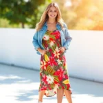
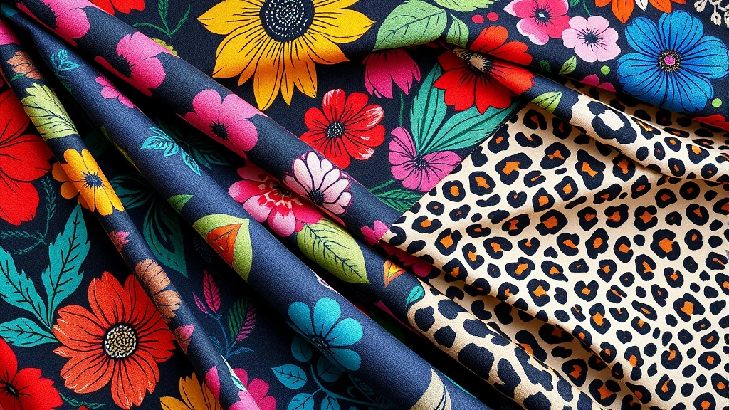
Floral Prints remain the most versatile and enduring bold print category. From oversized blooms to delicate botanical patterns, florals work across seasons and occasions. Designer brands like Vogue’s featured collections consistently showcase floral prints because they bridge the gap between feminine elegance and modern edge. When selecting floral prints, consider the scale—larger florals make bold statements, while smaller prints offer sophistication.
Geometric Patterns bring architectural interest to your wardrobe. Stripes, checks, chevrons, and abstract shapes create visual movement and can elongate or add dimension depending on direction and scale. Geometric prints work exceptionally well when you’re building a personal style foundation that leans modern and minimalist.
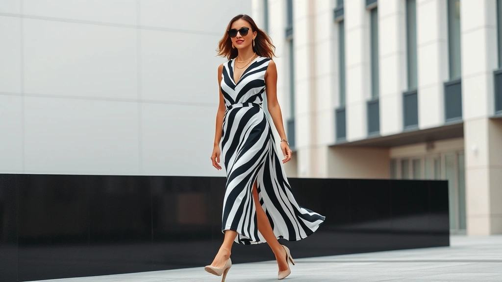
Animal Prints transcend seasonal trends and offer permanent fixtures in fashion-forward wardrobes. Leopard, zebra, snakeskin, and tiger prints add instant edge and sophistication. These prints pair beautifully with solid neutrals and work across casual, professional, and evening settings.
Abstract and Artistic Prints showcase individual creativity and artistic expression. Watercolor effects, paint splatters, and irregular patterns appeal to those who want their clothing to feel like wearable art. These prints require confidence but reward bold fashion choices with truly unique results.
The Art of Balancing Bold Prints
The most common fear about bold prints is overwhelming your appearance. Professional stylists and designers solve this through strategic balancing—pairing statement prints with solid pieces that allow the pattern to shine.
The Anchoring Technique involves surrounding a bold print with neutral, solid-colored pieces. If you wear a vibrant patterned dress, pair it with a neutral cardigan, simple shoes, and minimal accessories. This approach lets the print be the focal point without competing visual elements. Designers from luxury houses understand that restraint in other areas amplifies print impact.
The Complementary Approach uses solid colors that appear within the print itself. A botanical print featuring greens, blues, and cream works beautifully with solid green or blue separates. This creates visual cohesion and prevents your outfit from feeling chaotic. When exploring different types of fashion styles, you’ll notice this principle appears consistently across designer collections.
Proportion Matters Significantly when wearing bold prints. A large, statement print works best as a focal piece—think a bold print dress or statement jacket. Pair it with fitted, simple separates in complementary solids. Conversely, smaller bold prints can be mixed more liberally throughout an outfit because they don’t demand as much visual attention.
The Layering Strategy allows you to incorporate multiple bold pieces without creating visual chaos. A patterned shirt layered under a solid blazer, with solid trousers, creates interest while maintaining sophistication. The solid pieces act as visual breaks between patterned elements, preventing overwhelming visual competition.
Consider your personal proportions when implementing these techniques. Petite frames often benefit from smaller-scale prints worn as statement pieces, while taller frames can carry larger prints and more complex styling combinations. The key is ensuring your print selection and styling approach enhance rather than diminish your natural silhouette.
Color Theory and Print Selection
Bold prints gain power through strategic color choices. Understanding color theory transforms your ability to select and style prints that genuinely work with your complexion, wardrobe, and lifestyle.
Undertone Matching is fundamental. Determine whether you have warm, cool, or neutral undertones, then select bold prints featuring colors that harmonize with your natural coloring. Warm undertones glow with prints featuring golden yellows, warm reds, and earth tones. Cool undertones shine with prints featuring jewel tones, icy blues, and silvers. Neutral undertones enjoy flexibility across the spectrum.
Saturation and Intensity affect how bold a print truly feels. Highly saturated, intense colors create maximum impact and suit confident wearers comfortable commanding attention. Slightly muted or dusty print versions offer boldness with sophistication, appealing to those preferring subtle statement-making. Both approaches work equally well—the difference lies in your personal comfort level.
Color Blocking with Prints involves pairing bold prints with solid colors that create visual pop. A print featuring navy and cream pairs spectacularly with a red accent piece, creating visual interest through complementary colors. This technique, favored by contemporary designers, adds complexity and intentionality to your styling.
Monochromatic Print Styling uses prints in varying shades of a single color family. A black and white geometric print paired with black pants and a white blouse creates sophisticated coherence. This approach works beautifully in professional settings and proves that bold prints needn’t be colorful to make impact.
When exploring the Fashion Style Guide, pay attention to how color choices influence print perception. The same pattern reads differently depending on its color palette and surrounding styling choices.
Styling Techniques from Fashion Designers
Professional designers employ specific techniques when styling bold prints for runway presentations and editorial features. These methods translate beautifully to personal wardrobe styling.
The Statement Piece Approach designates one item as the focal point. A bold print dress becomes the star, with every other element—shoes, bag, jewelry, outerwear—selected to complement rather than compete. This method ensures your bold print receives appropriate attention and visual emphasis.
Texture Mixing adds sophistication to bold print styling. Pair a printed silk blouse with textured wool trousers, or combine a patterned cotton dress with a leather jacket. Varying textures prevent your outfit from feeling flat while maintaining visual interest through multiple dimensions.
Accessory Restraint proves crucial when featuring bold prints. Minimal jewelry, a simple bag, and straightforward shoes prevent accessory clutter. Designer collections consistently demonstrate that bold prints require breathing room—too many competing elements dilute the print’s impact and create visual chaos.
Footwear as Grounding Element anchors bold print outfits. Neutral shoes in black, white, nude, or navy ground patterned pieces and create visual stability. This principle applies across casual sneakers, professional heels, or everyday flats—the color choice matters more than the style.
Outerwear Strategy allows you to extend bold print styling across seasons. A neutral blazer over a bold print dress creates professional polish. A solid leather jacket transforms a patterned dress into edgy evening wear. These layering choices expand outfit versatility and styling possibilities.
Visit the Style Loom Daily Blog for additional designer-approved styling techniques and seasonal trend analysis.
Bold Prints for Different Body Types
Strategic print selection and styling enhance your natural silhouette and create flattering proportions. Fashion designers understand that the same print won’t work identically for every body type—placement, scale, and styling approach matter tremendously.
For Pear-Shaped Figures, bold prints work best on upper body pieces—shirts, blazers, and dresses with print-focused bodices. This draws attention upward and creates visual balance with wider lower proportions. Pair patterned tops with solid, darker bottoms for streamlined silhouettes.
For Apple-Shaped Figures, prints work beautifully in A-line dresses that skim the midsection, or as print scarves and upper-body accessories that draw eyes upward. Avoid prints that cling directly to the torso; instead, select styles that drape gracefully and create vertical lines.
For Hourglass Figures, nearly any bold print placement works because balanced proportions allow flexibility. Fitted printed dresses showcase your natural curves, while bold print blazers layer beautifully over solid pieces. Your advantage lies in the ability to wear more daring print combinations confidently.
For Rectangle-Shaped Figures, bold prints add dimension and create visual interest across your frame. Horizontal stripes add width, while vertical prints create length. Patterned pieces that gather, ruche, or feature dimensional elements add curves and visual fullness.
For Plus-Size Figures, larger-scale prints often work more flatteringly than busy, small-scale patterns. Vertical prints and those with directional elements create lengthening effects. Monochromatic prints in single color families offer bold impact while maintaining visual streamlining.
Understanding your body type and how to leverage bold prints to enhance your natural features builds confidence and ensures your print selections work harmoniously with your unique silhouette. When exploring 90s Fashion Trends, notice how print placement and sizing varied based on the models’ proportions—this principle remains constant in contemporary fashion.
Seasonal Bold Print Styling
Bold prints translate across all seasons with strategic adjustments to weight, fabric, and color palette. Seasonal styling ensures your print pieces work year-round while maintaining weather-appropriate comfort.
Spring Bold Print Styling embraces fresh colors and lightweight fabrics. Floral prints in pastels and bright hues work beautifully in linen and cotton. Pair print blouses with white jeans, or wear bold print dresses with minimal layering. Spring allows maximum print visibility through lighter, more transparent fabrics.
Summer Styling maximizes bold print impact through minimal layering. Printed sundresses, short-sleeved shirts, and lightweight trousers showcase bold patterns without heavy covering. Incorporate prints through swimwear, cover-ups, and resort wear. The warm season invites the brightest, most saturated prints your wardrobe contains.
Fall Styling transitions prints into richer color palettes—burgundy florals, deep jewel tones, and warm earth tones. Layer printed pieces under cardigans and blazers. Bold print scarves introduce pattern without requiring full pieces. Pair prints with warmer neutrals like camel, rust, and chocolate brown.
Winter Styling incorporates bold prints through layering and heavier fabrics. Printed sweaters, patterned coats, and bold print scarves maintain visual interest while providing necessary warmth. Jewel-toned prints, geometric patterns, and animal prints work beautifully against winter’s cooler color palette.
The Fashion Nova Dresses Collection demonstrates how prints adapt across seasons through fabric weight and color selection while maintaining bold visual impact.
Common Mistakes to Avoid
Even fashion enthusiasts sometimes struggle with bold print styling. Understanding common pitfalls helps you navigate print selection and styling with greater confidence and success.
Mistake One: Competing Patterns occurs when multiple bold prints clash without visual cohesion. Mixing prints requires intentional planning—either select prints in complementary color families, use similar scales, or separate competing prints with solid pieces. Avoid random pattern mixing that creates visual chaos.
Mistake Two: Neglecting Scale happens when large-scale prints overwhelm petite frames, or small-scale prints disappear on larger figures. Consider your proportions when selecting print scale. Test pieces before purchasing whenever possible, and view yourself from multiple distances to ensure the print works with your frame.
Mistake Three: Over-Accessorizing diminishes bold print impact. Restrain jewelry, keep bags simple, and limit accessories to one or two statement pieces. Let your bold print be the focal point rather than competing with excessive accessory layering.
Mistake Four: Ignoring Undertones results in prints that clash with your complexion despite being beautiful pieces. Always consider how print colors interact with your natural coloring. What looks stunning on a model with different undertones might not serve your complexion equally well.
Mistake Five: Wearing Prints Without Confidence undermines even perfectly styled outfits. Bold prints require conviction—wear them deliberately and purposefully. Hesitant styling reads as uncertain, while confident styling communicates intentional fashion choices.
Mistake Six: Ignoring Occasion Appropriateness creates styling missteps. While bold prints work across contexts, some patterns suit casual settings better than professional environments. Consider your setting and select prints accordingly—save the brightest, most playful patterns for casual contexts, and choose sophisticated prints for professional situations.
FAQ
Can I wear multiple bold prints together?
Yes, but strategically. Choose prints in complementary color families, similar scales, or separate them with solid-colored pieces. Prints that share color tones or design inspiration work better together than random pattern mixing. Start with print combinations featuring neutral backgrounds, which simplifies visual cohesion.
What shoes work best with bold print outfits?
Neutral shoes ground bold print outfits most effectively. Black, white, nude, navy, or gray shoes work universally. For casual settings, simple sneakers or flats suffice. Professional contexts benefit from neutral heels or loafers. The shoe color matters more than style—aim for colors that appear in your print or neutral tones that don’t compete for attention.
How do I style bold prints for professional settings?
Select sophisticated prints in jewel tones, monochromatic palettes, or subtle geometric patterns. Wear bold print blazers with solid trousers, or patterned dresses with neutral cardigans. Minimize jewelry and accessories, and pair prints with professional footwear. Avoid prints that feel too casual or playful for your workplace culture.
Are bold prints flattering for all ages?
Absolutely. Bold prints work beautifully across all ages when styled appropriately for your personal aesthetic and lifestyle. Younger wearers might embrace brighter, more playful prints, while mature wearers often prefer sophisticated patterns in jewel tones. The key is selecting prints that align with your style sensibility rather than age-based restrictions.
How do I know if a bold print flatters my complexion?
Test prints against your skin in natural lighting whenever possible. Notice whether colors appear vibrant and complementary, or whether they wash out your complexion. Prints featuring your undertone colors will appear more flattering. If you can’t test in-store, purchase from retailers with generous return policies to test at home.
Can I wear bold prints in minimalist style?
Yes, through monochromatic prints, geometric patterns, and restrained styling. A black and white striped dress, solid neutral pieces, and minimal accessories create minimalist aesthetic while incorporating bold print elements. The key is selecting prints that align with minimalist principles—geometric, structured, and uncomplicated patterns work better than busy florals.
What’s the difference between bold and busy prints?
Bold prints are confident, clear, and intentional—they make statements through color, scale, or distinctive patterns. Busy prints feature excessive detail, competing elements, and visual confusion. Bold prints enhance outfits; busy prints often overwhelm them. When selecting prints, ask whether the pattern reads as confident statement or chaotic confusion.